

As part of our Top 10 Fund Factsheets of 2025 review, Factbook assessed more than 200 fund factsheets, with the Top 15 analysed in detail across a consistent scoring framework. By averaging the scores across these Top 15, a clear picture emerges of where the industry is performing well, where opportunity lies, and where there is genuine threat to the industry.
Using those averaged scores, here is a SWOT analysis of the current state of fund factsheets.
Strength: Design is no longer the problem
Across the Top 15 factsheets, Design achieved a combined average score of 8.6 (out of 10), the highest of our four categories. This is a strong result and reflects how far the industry has come in visual presentation, branding consistency and general aesthetic quality.
Most leading asset managers now produce factsheets that look professional, credible and align with brand expectations. Typography, colour usage and visual hierarchy are broadly well executed, and “poor design” is no longer the primary factor holding factsheets back.
This improvement is encouraging, and it sets a higher baseline for what investors expect to see.
Weakness: Layout & Usability lag behind
Despite strong design scores, Layout & Usability averaged just 6.9 across the Top 15, the lowest of our four categories. And, it must be remembered, this was across the 15 best fund factsheets that we looked at.
This highlights a crucial distinction: good design does not automatically translate into good usability for the reader.
Common issues include:
- Dense page layouts
- Over-reliance on tabular data
- Poor prioritisation of key information
- Sections that feel logically disconnected
In short, factsheets often look good, but still work harder than they should for the reader.
Opportunity: A chance for competitive advantage
This gap between design quality and usability creates a clear opportunity.
Very few firms are truly excelling at layout that responds intelligently to content variability, and one which scales gracefully as complexity increases, and guides the reader effortlessly through the document.
For firms that can crack this, through better templates, structured workflows and automation, layout and usability become a genuine differentiator. In a crowded market where most factsheets look broadly similar, ease of use could be the deciding factor.
Threat: Risk disclosure is the weakest area
The most concerning finding sits within the Layout & Usability category.
Across the Top 15, Risk Disclosure scored just 6.6 on average, the lowest score of any sub-judging sub-category.
Clear and prominent disclosure of risk is not optional. Under FCA regulations, firms are required to present risks in a way that is fair, clear and not misleading. When risk information is hard to find, poorly structured or visually deprioritised, firms expose themselves to regulatory scrutiny as well as reputational damage.
This makes weak risk disclosure a genuine industry-wide threat, not just a presentation issue.
How the Top 15 scored
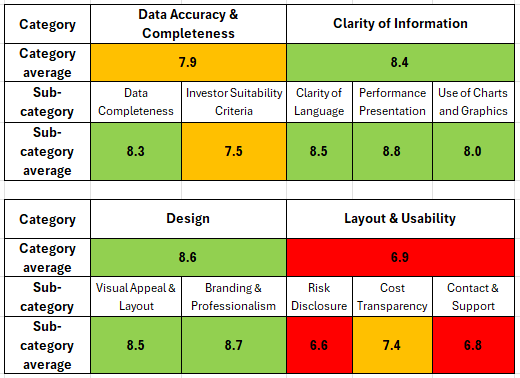
Table 1: the average scores, out of 10, for the Top 15 Fund Factsheets per category and sub-category.
Conclusion: From looking good to working well
The message from the Top 15, using the scoring data in the table above, is clear: the industry has largely solved how factsheets look, but has not yet solved how well they work.
The next phase of improvement will not come from more design polish, but from better layout logic, stronger usability and workflows that ensure critical information, especially risk disclosure, is presented clearly and consistently every time.
For firms willing to invest in automation and structured reporting processes, the opportunity is significant. For those that don’t, the risks are increasingly visible.